Now that we were officially recognized by the IRS and received our first donation, we wanted to host a Christmas party for the foster kids that attended SBC’s Royal Family Kids’ Camp. This would be a first – an event outside of camp for the kids.
However, before we could host a Christmas party, Hope and A Future needed a logo for the charity. What would this look like?
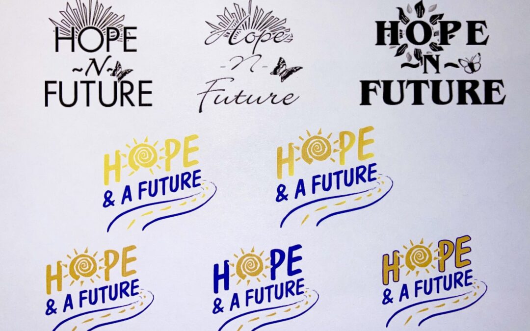
While Kelli and I had various ideas, it is a lot more difficult to convey those ideas to a graphic designer and choose a logo. After all, this was probably the most important decision we were making early on as it would define who we are and what we do. It’s hard to undo a logo choice once your start, so we needed to get it right.
Kelli reached out to a local company called Lift Him High and its owners, Kevin Hillis & Frank Sanders. We shared how we needed a logo for a new charity and they got to work.
As you can tell, the logo evolved from the initial drafts. After the first couple of drafts, I explained more of the meaning behind what I envisioned for the logo.
First, I wanted a sun in the logo – either standing alone or incorporated into the letter O. I explained that, “The reason for the sun is that that the purpose of Hope and a Future is to bring God’s light to these children and bring them out of the dark times in their lives. Having a sun shine in the logo just seems to embody this.”
Second, I wanted the words “Hope and A Future” at a slant because it suggested moving forward. While the kids are in foster care, they won’t be stuck there their entire lives. They’ll be moving forward in life and we can be part of that journey.
Third, if we incorporated a sun into the word Hope itself, then I wanted a pathway under the words. This would reflect Proverbs 3:5-6: “Trust in the LORD with all your heart and lean not on your own understanding; in all your ways submit to him, and he will make your paths straight.” This was a verse taught at Royal Family Kids’ Camp. Thus, the sun could be illuminating their path, symbolizing how God shines light on their path – no matter where they might be on their journey.
After giving more background on the reasons behind what I was thinking, Kevin really brought it together quickly. Finally, I shared that I wanted the words and the outline of the path to be the same color purple from Royal Family Kids’ Camp. (Over the years, the purple has morphed into a blue due to printers & other graphic designers not fully understanding the reason for the color.)
There were still drafts and options to choose from, but Lift Him High quickly brought it together. It didn’t take long before we knew that we had the logo for the organization. Lift Him High also blessed us because they didn’t charge us for their work!
Hopefully, the logo embodies this when the kids, volunteers and donors see the logo: God shinning his light down on the paths of the kids who are on their foster care journey….and through it all, God has plans for their life….plans of Hope & A Future.
Michael Brewer, President
Hope & A Future